Elma Retreat
Partially created out of the desire to dispel the commonly held belief that only traditional homes are acceptable in Western New York’s South Towns, this beautiful contemporary home was the end result of a wonderful partnership with the homeowner. Set back over 1500ft from the road, the immediate area around the residence and dwellings design were intended to create the sensation of a retreat, reinforcing the departure from the daily grind.
The design had to respond to the homeowners’ desire for public (family) spaces that would flow seamlessly for ease of living and the be capable of hosting extended family gatherings yet still remaining comfortable for daily use. The front and rear exterior patios are intended to function as both an extension of the interior living areas and as buffers from the wilds of the surrounding natural site.
Private areas of the house are separated by elevation changes and buffered by transitional spaces, with the master bedroom suite located on the upper floor, and the remainder of the bedrooms and private family lounge on the lower floor tucked away from the larger “public” living & kitchen area in the rear of the dwelling. They are also sized smaller than typically seen in current bloated designs, to reinforce the feeling of intimacy and privacy. Adjoining spaces provide all required amenities as needed for daily tasks.
Detailing of the exterior materials were used to break up the horizontal masses of the main body of the house, with the stone veneer continuing from the exterior envelope inside to interact with the interior materials, a combination of exquisite wood paneling, wallpapers, and decorative stones, are all visually connected throughout the house. Each helps define a transition from one space to the next.
Private spaces are laid out to reinforce the feeling of separation from the hustle and bustle of the outside world, with a warmth of material selections made to foster the feeling of relaxation. Large windows are placed as strategic locations so that the beauty of the adjacent woods can be socked in while still providing privacy when desired.
Photo: Kim Smith Photo
Interior Design: Robert Reeder Interiors
Contractor: M Metros Builders
2021 Buffalo/WNY AIA Merit Residential Project Award winner.

1 Penhurst Park
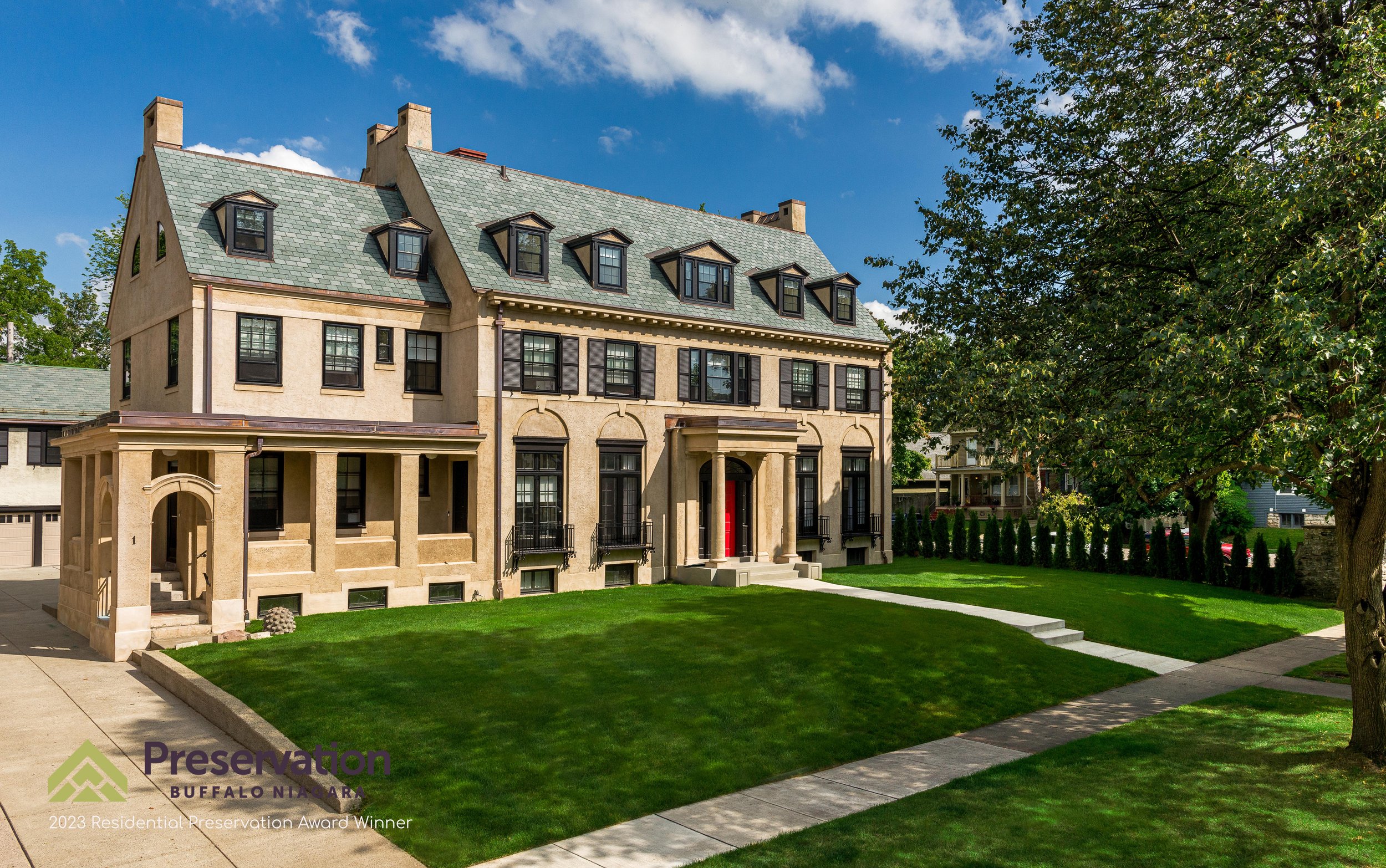
While the focus of the project was to inject new life into the primary living spaces of this home, the design and construction team also had to keep an eye on the historical integrity of the one of Buffalo premiere homes.
The work included the painstaking repair and in some cases the recreation of critical historic elements on the exterior of the home. All the windows were repaired and refinished by local craftsman, and extensive areas of plaster repairs were required from years of water infiltration. The sunroom on the rear of the house was found to have structurally failed from moisture damage resulting in its complete reconstruction. The majority of the dental moldings at the roof line needed to be recreated, utilizing mold taken from those examples remaining. A new slate roof was installed, replacing a previously removed element from the original home.
While the client mandated that the renovation take a wholistic approach to the preservation of the property, the home still had to meet the needs of the family. Where possible rooms were returned to their former glory, where required critical everyday spaces were updated to meet the needs of the homeowner. All the bathrooms required new plumbing and got extensive make overs, the primary bathroom was a complete renovation as was the kitchen.
We proudly accepted a 2023 Preservation Buffalo Niagara Residential Preservation award for this project.
Photo: Julian Ross Imaging
Contractor: Peyton Barlow Company

An English Kitchen
The goal was to create a working space that not only was beautiful to the eye, but as easy to use as a traditional English Kitchen, the result is Rhapsody in Blue. While the single open volume is a focal point of daily family life, the kitchen is skillfully divided in working, preparation, and storage area.
The exposed brickwork of the chimney housing a wall oven is reminiscent of the old-fashioned fireplace and heavy wood mantel found in English homes. The scullery functions as well as any butler’s pantry while being as visually intoxicating as the remainder of the space.
A large working island is designed to recreate the versatility of the traditional rustic prep table, at the same time providing a barrier to protect the cook from intrusions by the rest of the family.
The material palette references those found in the English design, with a heavy reliance on blues and natural finishes. In addition to antique inspired lighting, a large window was added to bring in plentiful natural illumination.
On any given game day, it’s a wonderful place to catch the match from White Heart Lane.
Photo: Julian Ross Imaging
Interior Design: Philippa Radon Design
Contractor: M Metros Builders

Amherst Family Room
Driven by a client who was focused on maximizing family interactions, the program was the creation a space that the whole family would want to spend time in together, house an art collection and be a piece of contemporary architecture that would sit well with the traditional style of the existing home.
With a purist design approach and the desire for clean materials, the selection of glass and zinc panels was made to provide a luxurious quality, without appearing overdone. The goal was to connect the inside with the outside naturally, and the best result of this addition is the harmonious integration of interior and exterior spaces.
The black and glass facade hides and shows its natural surroundings, and large planting areas with greenery are integrated immediately adjacent to the mudroom, which becomes the main entry point to the house for the family. Large surfaces such as a custom-made bar area, benches, racks, and outdoor kitchen area are applied throughout the property to connect the different areas.
Paradoxically this home has many open views and transparency in the facades, yet at the same time feels private and protected by the lush green and smart arrangement in its layout. A perfect retreat to spend your time inside and outside. The sober and pure material pallet brings about a relaxed atmosphere of natural luxury.
We proudly accepted a 2020 AIA Buffalo/WNY design award for this project.
Photo: Julian Ross Imaging
Contractor: M Metros Builders

Ellicottville Stone House
This year-round home, located on the outskirts of Ellicottville NY, was built by its owners literally one stone at a time. The house was designed to inspire a little piece of home in the style of a French farmhouse.
A large wine cellar and a naturally cooled food locker dominate the basement, which has a pass-through in the living room floor. An exterior entry also functions as a stone retaining wall that provides a protective barrier to the home from the steeply sloping site.
The kitchen and Living Room dominant an intentionally open first floor plan. A centrally located, oversized stone fireplace with a heavy wood mantel, and a single steep elevation change are the only barrier elements needed to define the different spaces. Refinished and re-glazed patio doors provide both views of the thick natural foliage of the gully outside, and plentiful natural illumination.
Perfectly sized second floor bedrooms are about cozy comfort over excessive size. The bathroom not only has all the typical amenities, but also amazing views on the snowcapped valley beyond.

Tipico Coffee
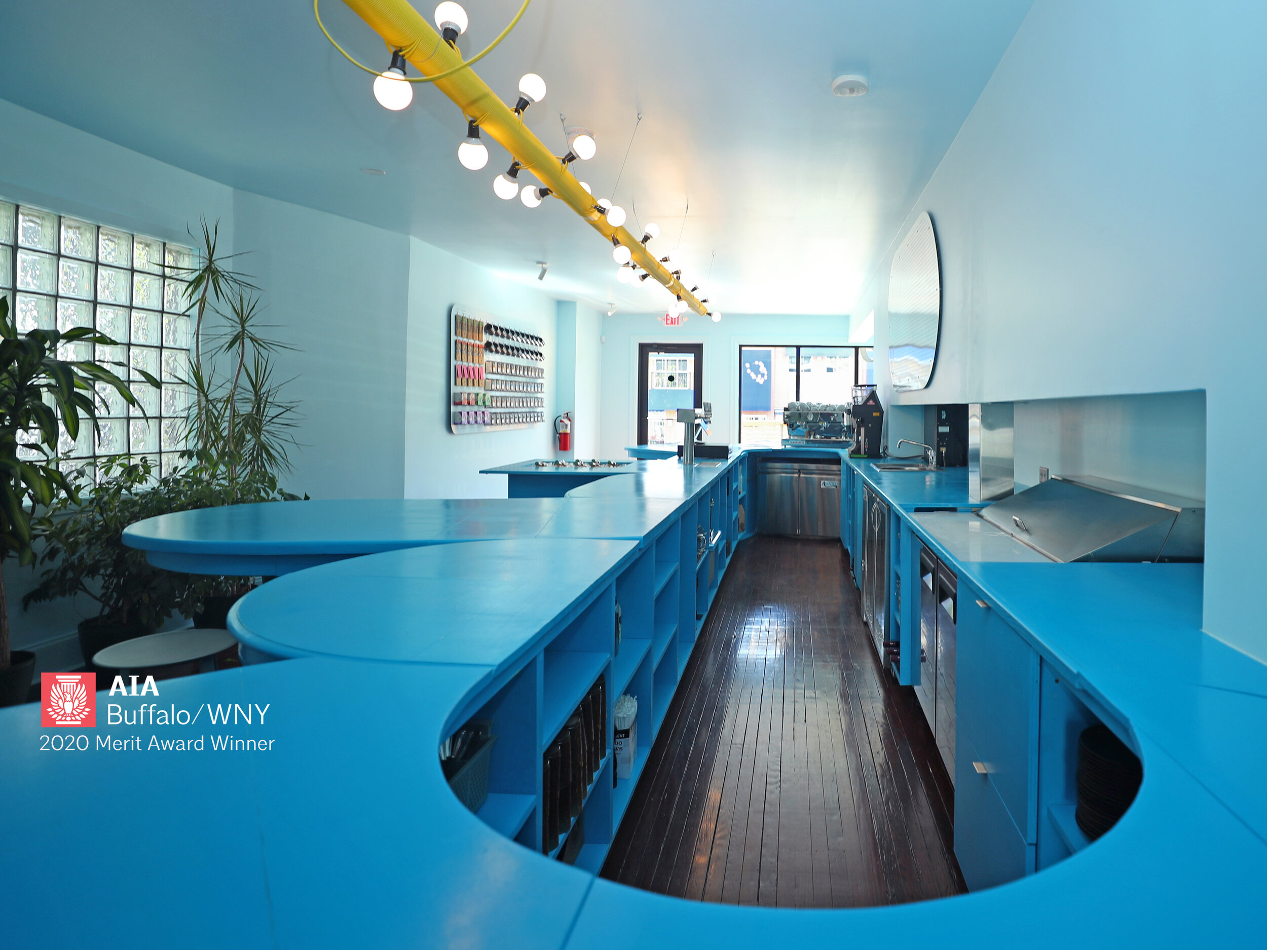
A partnership with Canadian couple Julia Jamrozik & Coryn Kempster, this project was driven by a conceptual approach focused on maximizing social interactions and the bespoke use of ordinary materials, this design creates a café with a vibrant identity.
The interior occupies the main level of a century-old house, that had over the years been stripped of its charm and layered with generic modifications. To downplay the many columns and walls that interrupted the space, the layout of the interior was organized with the strategic insertion of new walls to calm the existing condition. The cafe, developed with a tight construction budget in mind, is composed of a select number of idiosyncratic elements inserted into this existing shell.
The primary component of the cafe is the bar, which is comprised of ten reclaimed wood tables that have been grafted together and painted a unifying sky-blue color. On the service side, the long bar encourages the engagement between staff and customers beyond the initial transaction, while responding to the functional needs of different work zones for the baristas. On the customer side, the undulating profile of the bar further creates opportunities for customers to interact with one another by providing places to sit for individuals and groups of various sizes, without clearly delineating where one zone starts and another begins.
The swiveling bar stools help to promote this open-ended approach, allowing individuals to move their seated body towards others to perhaps engage in conversations they did not expect to have. Thus, testing the comfort levels of occupants and promoting moments of interaction between strangers, the bar acts a social infrastructure.
Alongside the reclaimed tables, off-the-shelf materials are used in the café. This includes pegboard, which wraps the underside of the bar and is used for merchandise displays. Further, the three bespoke linear lights over the bar and benches are made from construction-site string lights wrapped around aluminum tube stock, combining the functional and the whimsical.
Overall the modest interior is guided by a desire to create a playful space that caters to functional needs while providing an idiosyncratic social infrastructure through strategic insertions.
We proudly accepted a 2020 AIA Buffalo/WNY design award for this project.
Photo: Sara Schmidle Photography
Contractor: Reuse Action

Elmwood Lofts
Abstract Architecture PC provided Architectural documents and construction administration services for what was a game changer for multi-family, mixed-use development in the Elmwood Village, a premier Western New Work neighborhood.
The project team meet extensively with local community groups to ensure that the amenities were a welcome addition to the neighborhood. At street level there are three commercial spaces fronting the vibrant Elmwood Ave, sized for local start up business. Above are three floors of residential units, 29 in total, a mixture of 1- & 2-bedroom apartments.
Material selection was important to the design team. We set out to improve the standard of exterior materials, utilizing brick, terra-cotta tile, and decorative fiber-cement panels.
Photo: Julian Ross Imaging
Contractor: RP Oakhill Building Company

Wayland Brewery
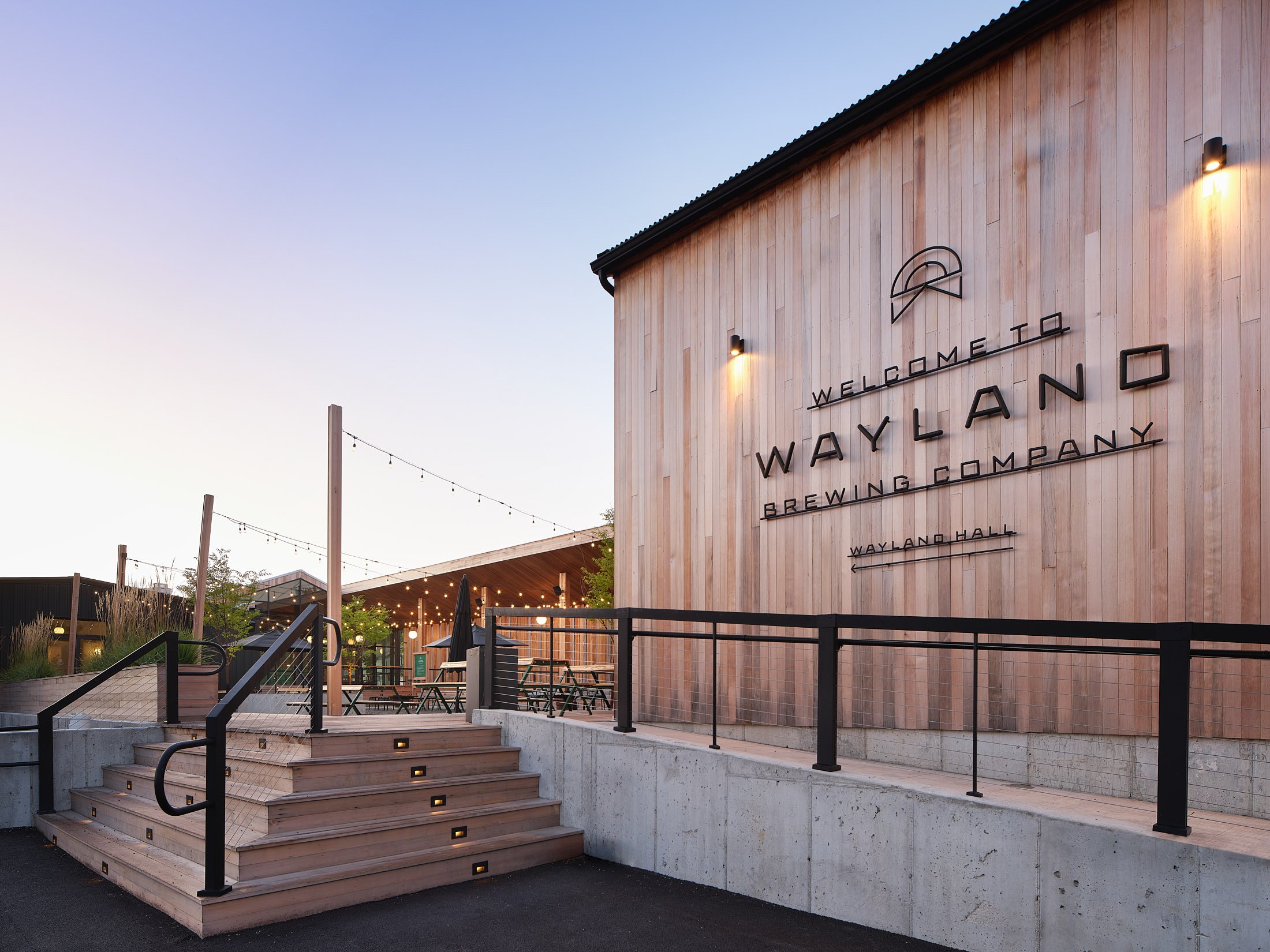
Abstract Architecture PC provided Architectural documents and construction administration services for what has to be the premier brewery and event space in Western New Work. The desire for Wayland Brewery was the fulfillment of a simple goal: to give people a place where they could gather. In the process, what was created is an escape.
More than a beer garden or a brewery, Wayland is a place to get away from the grip of workaday life and celebrate the things that really matter. Every element of the operation, from the greenhouse-inspired taproom to the refined event space to the curated lawn games, has been designed to evoke the serenity of days gone by. You’ll find an expertly crafted menu and traditionally brewed beers that are perfect for any occasion.
Working alongside the design team, the only successful outcome was a final product that far exceeded the quality typically found in WNY event space.
Photo: Kim Smith Photo
Contractor: Lamparelli Construction
Civil Engineering: Chris Wood
Landscape Design: Joy Kuebler
Branding: Block Club
Caryn Dujanovich | Lead Designer

Moriarty Meats
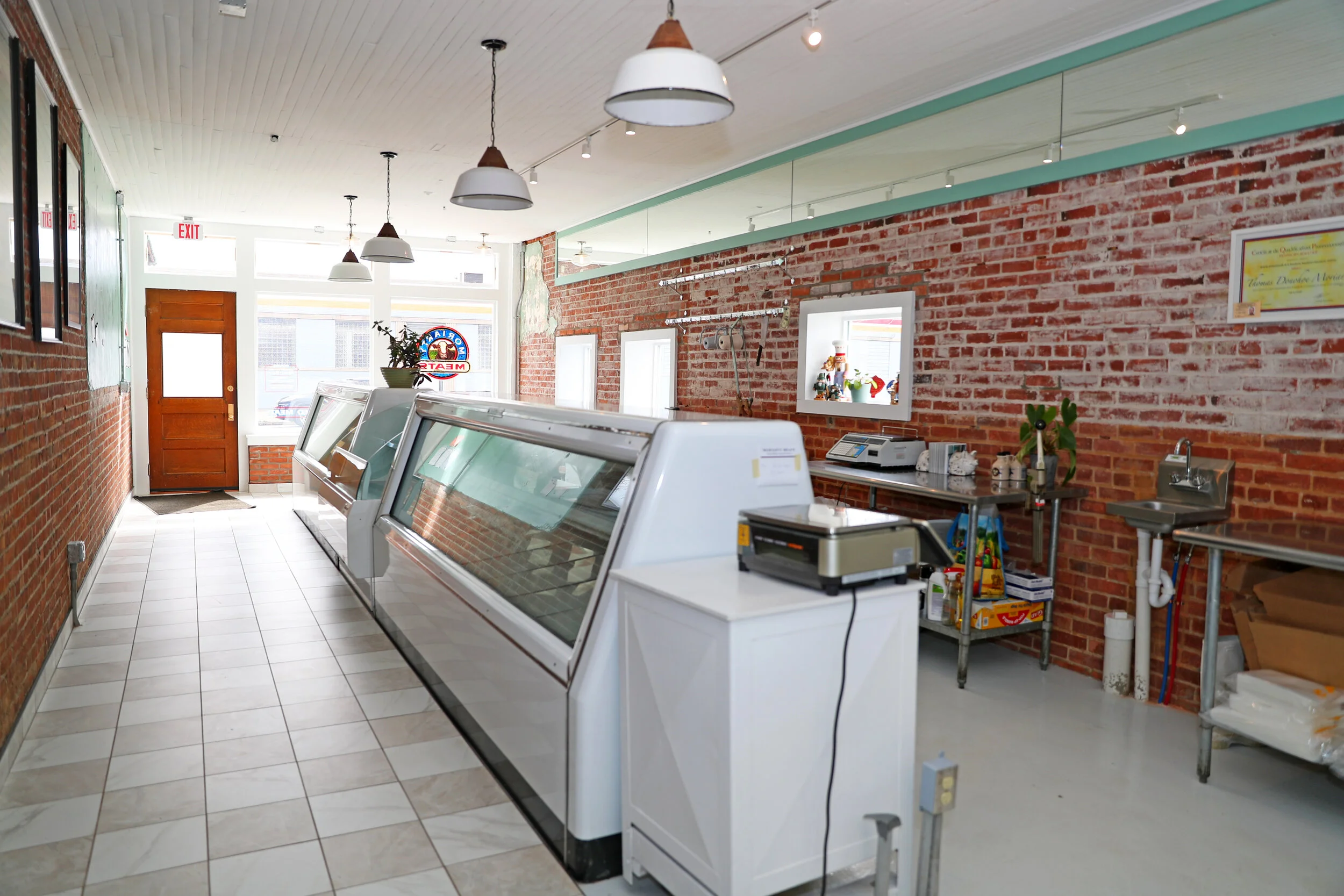
If you are going to sell premium freshly butchered meats, you may as well have a beautiful space from which to sell it! Partnering with Tom and Caitlin Moriarty and the team at West End Interiors, we had a lot of fun turning an old car sales office on Elmwood Ave into the coolest whole animal butchery in Buffalo.
The layout provides a space for everything, from a bright and airy front of shop with lots of display space, to a highly visible butchery workroom adjacent to the walk-in cooler, where you can watch Tom work his magic. The design and finishes of the space are inspired by traditional European butcheries, with exposed brick and a large wood framed storefront, which was rebuilt based on photos of the original building. The space had to be simple and organic, reinforcing the ways of the traditional French butchery, creating minimal wasted space.
Beyond being just a butcher’s Shop, Tom and Caitlin have added the Café Bar in the adjacent former Vino’s restaurant space, where fresh local foods can be savored, and the fun of social interaction can be enjoyed.
Photo: Sara Schmidle Photography

Larkinville Live/Work²
When you have a pair of “cool customers” with an open mind and start with the shell of a historic brick building in the ever-expanding Larkin District, you know the results are going to be awesome.
With the “work” portion of the program dominating the first floor, each space was designed to meet the specific demands of each specific business operation, with a shared office being the primary divider and connection between the front and rear working spaces.
The second floor “live” portion of the program is a beautiful single-bedroom program with a spacious open-plan living/kitchen space. The residential portion of the renovation is flooded with loads of natural light and comes complete with amazing views out over a quickly changing streetscape.
Photo: Sara Schmidle Photography

Parkside Attic
Sometimes you have all the luck in the world, a wonderful pair of clients, an incredibly maintained Four Square home, and a fascinating project. The result is the transformation of an empty attic into a fun and playful master bedroom that is as easy live in as it is to love!
It was important for the homeowners that the traditional style and materials of the original home were maintained so mechanicals were skillfully tucked away out of sight and from the second-floor landing, there is no hint of the excitement that lays ahead on the other side of the bedroom door.
Colors and materials reflect the homeowner’s playful and creative nature and help tie the two personalities of the home together, just as the importance of art is evident throughout the home. By maintaining as much height as possible and walls not being allowed to touch the ceiling, the space keeps a light and airy feeling that is critical for well-being. With large areas of the wall between the sleeping area and the bathroom being transparent, it not only allows plentiful light throughout the space the entire day, it helps maintain the feeling of spaciousness in what could have very easily been a very segmented space.
Photo: Jim Cielencki Photography
Contractor: Johnson Renov8tors

Delaware Park Residence
Originally Built for the sister of Charles Rand Penney, and the location of many of his winter work sessions, the new owners of this Buffalo city residence undertook a complete renovation to make the house their own. The work included reversing the work of a previous ill-conceived renovation, revising the dated interiors, addressing poor circulation within the residence, and providing improved access to the ample property.
Both first and second floors underwent extensive renovations to improve livability and handle the day-to-day grind of not only family life but to provide a residence that is ideal for entertaining and the display of a beautifully eclectic art collection. The final design provides separate private areas for individual family members while still maintaining open and easy-to-use spaces where the family can come together.
The first floor is divided into public and private areas. Large spaces for family life are bathed in natural light and combine to create space for entertaining. Two primary axis suitably direct people through the public spaces and lead users out onto the patio and the large pool. A large master suite dominates the private area of the first floor and is placed in the rear of the residence to really give a feeling of solitude and privacy.
The second floor is intended for the family to spend time together, with a large tv lounge with an adjacent small homework area which will transition to a home office as kids get older. Two separate bedroom suites surround the family space providing each family member with their own distinctive individual space.
Photo: Cesar A Cedano/arqpop

Buffalo RiverWorks Entertainment Complex
Abstract Architecture provided Design and construction administration services from the inception of this exciting and transformative Buffalo River front project. The project took a former industrial site on the Buffalo River and turned it into a bustling year-round entertainment complex.
With road and river dock access, two covered hockey rinks, a professional roller derby team, Buffalo’s own Queen City Roller Girls of the Western New York all-women roller derby league, and a brewery housed in a grain elevator, Buffalo RiverWorks has become the “place to be” on the Buffalo River.
We set out to save as much of the two existing structures as possible, with the main entertainment space, and new back of house facilities (locker rooms, kitchen, and delivery) housed in new infill construction that connected the separate buildings to create a single 60,000 square foot complex.
The main floor can be quickly transformed from accommodating 2,500 people watching roller derby to upward of 4,000 people for Mixed Martial Arts or even 5,500 people in concert format. The majority of the time the main space functions as a full-service restaurant. There is a mix of sized semi-private, indoor and outdoor areas intended for multiple events to be held at the same time.
Stuffed skillfully into the grain elevator, locally known as the “Six Pack” for its distinctive exterior decoration, is a 20-barrel brewery that provides all the tap beer for the bars on the property.
We proudly accepted a 2016 AIA Buffalo/WNY design award for this project.
Photo: Cesar A Cedano/arqpop
Home Gallery

